The design of a gas station logo is a crucial aspect of a company's brand identity, as it often serves as the first point of contact for potential customers. A well-designed logo can convey a sense of professionalism, reliability, and quality, while a poorly designed logo can have the opposite effect. In the context of gas stations, logos are often displayed prominently on signage, pumps, and other marketing materials, making them a vital component of a company's visual identity.
Key Points
- The primary function of a gas station logo is to identify the brand and differentiate it from competitors.
- A successful gas station logo should be simple, yet distinctive, and easily recognizable from a distance.
- The use of color, typography, and imagery in a gas station logo can significantly impact its effectiveness and appeal.
- Gas station logos often incorporate elements that evoke a sense of energy, motion, and speed, such as abstract shapes or stylized letterforms.
- The design of a gas station logo should be adaptable to various formats and sizes, including signage, business cards, and digital applications.
Design Principles for Gas Station Logos

When designing a gas station logo, several key principles should be considered to ensure the logo is effective and memorable. These principles include simplicity, scalability, and legibility. A simple logo design is essential for a gas station, as it will be viewed from a distance and must be easily recognizable. Scalability is also crucial, as the logo will be used in various formats, from small business cards to large signage. Legibility is another important factor, as the logo should be easy to read and understand, even when viewed from a distance.
Color Palette and Typography
The color palette and typography used in a gas station logo can significantly impact its effectiveness and appeal. Bold, vibrant colors such as red, yellow, and orange are often used in gas station logos, as they can evoke a sense of energy and excitement. The typography used in a gas station logo should be clear and easy to read, with a font style that is modern and dynamic. Some gas stations may choose to use a custom-designed font or a stylized version of a standard font to add an extra layer of uniqueness to their logo.
| Logo Design Element | Description |
|---|---|
| Color Palette | Bold, vibrant colors such as red, yellow, and orange |
| Typography | Clear, easy-to-read font with a modern and dynamic style |
| Imagery | Abstract shapes or stylized letterforms that evoke a sense of energy and motion |

Examples of Successful Gas Station Logos

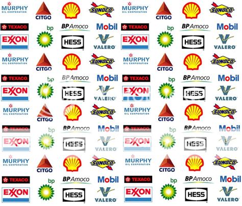
There are several examples of successful gas station logos that demonstrate effective design principles. For instance, the Shell logo features a stylized pecten symbol that is simple, yet distinctive, and easily recognizable from a distance. The ExxonMobil logo, on the other hand, features a bold, modern design that incorporates a stylized letterform and a dynamic color scheme. These logos have become iconic in the industry and are instantly recognizable by customers.
Best Practices for Gas Station Logo Design
When designing a gas station logo, there are several best practices to keep in mind. First, it’s essential to conduct thorough research and analyze the competition to ensure the logo is unique and distinctive. Second, the logo should be designed with scalability in mind, to ensure it looks good in various formats and sizes. Third, the logo should be simple, yet memorable, and easy to recognize from a distance. Finally, the logo should be adaptable to different marketing materials, such as business cards, signage, and digital applications.
What are the key elements of a successful gas station logo?
+A successful gas station logo should be simple, yet distinctive, and easily recognizable from a distance. It should also be scalable, legible, and adaptable to various formats and sizes.
How can I ensure my gas station logo is unique and distinctive?
+To ensure your gas station logo is unique and distinctive, conduct thorough research and analyze the competition. You can also work with a professional designer to create a custom logo that meets your specific needs and preferences.
What are some common mistakes to avoid when designing a gas station logo?
+Some common mistakes to avoid when designing a gas station logo include using a logo that is too complex or cluttered, failing to consider scalability and legibility, and neglecting to ensure the logo is adaptable to various marketing materials.
Meta Description: Learn about the key principles and best practices for designing a successful gas station logo, including simplicity, scalability, and legibility. Discover how to create a unique and distinctive logo that effectively represents your brand and appeals to your target audience. (149 characters)


